Are You a Cool Summer? The Color Palette That Makes Your Features Glow
If you’ve ever noticed that warm colors feel overpowering on you, yet extremely Bright Winter shades feel slightly too sharp, you may belong to the Cool Summer color palette.
Cool Summer is one of the most elegant palettes in the seasonal color analysis system. Instead of warmth or heavy intensity, this season is defined by cool undertones, balanced brightness, and a refined level of contrast.
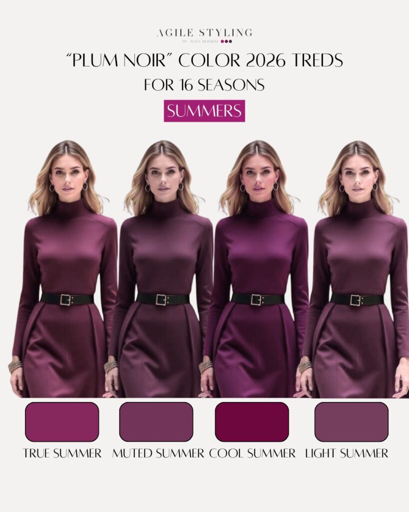
In the 16-season system, Cool Summer sits between True Summer and Cool Winter. It is what we call a flow season, meaning it borrows qualities from both neighboring palettes.
But there is an important distinction to understand.
In the 12-season system, Cool Summer is actually treated as a true season. In the 16-season system, however, Cool Summer becomes a flow between Summer and Winter.
This means the colors are still cool, but they are slightly deeper and brighter than the traditional True Summer palette.
A simple way to think about it is this:
Cool Summer is essentially True Summer — but with a little more power.
Or, as I sometimes jokingly describe it: True Summer on steroids.
If someone lands in the Summer family but finds that True Summer colors look too light or too muted, Cool Summer often becomes the natural solution.
Flattering Shades Every Cool Summer Should Own
Because Cool Summer sits closer to Winter than True Summer does, the palette includes colors that are slightly deeper and more vivid while still maintaining cool harmony.
Some of the most flattering shades include:
Emerald-based Greens
Soft emerald, deep sea green, and ocean blue-greens add clarity and brightness to the complexion.
Indigo and Ocean Blues
Indigo blue and rich ocean blues bring depth while still staying within the cool family.
Soft Magentas
Magentas and cool berry tones add color to the face without overwhelming it.
These shades are noticeably more vibrant than the typical True Summer palette, which leans toward soft blues, dusty teals, and delicate pastels.
Cool Summer colors are still elegant and balanced — just a touch stronger and more defined.
Colors to Skip
Certain colors disrupt the harmony of the Cool Summer palette.
Warm Oranges and Yellows
These shades tend to clash with the cool undertone of the palette and can make the complexion appear dull.
Harsh Black
Pure black can feel too heavy against Cool Summer softness.
Instead, experiment with alternatives such as:
Charcoal in particular is often a much better replacement for black within the Cool Summer wardrobe.
Cool Summer Makeup & Jewelry
Makeup for Cool Summer should reflect the palette’s cool undertone with slightly stronger clarity than True Summer makeup.
Lip colors often work beautifully in:
Eye makeup can include:
Compared to True Summer, the makeup can be slightly deeper and a bit brighter, but it should still remain balanced and refined.
Jewelry typically looks most harmonious in silver, white gold, or platinum, which complement cool undertones beautifully.
Can You Tell if You Are a Cool Summer?
Cool Summer individuals can vary quite a bit in appearance, which is why self-diagnosis can be tricky.
People in this palette often have more contrast and clarity than True Summers.
Common characteristics may include:
Overall, the coloring tends to look more defined and slightly more contrasted than the softer, more delicate appearance often seen in True Summer.
Because this range can be quite broad, guessing your season based only on descriptions is rarely reliable.
If you suspect you might be in the Cool Summer palette but find that True Summer feels too muted or soft, the best step is to have your colors professionally analyzed.
Why Knowing Your Color Palette Changes Everything?
Understanding your color palette simplifies many styling decisions.
Shopping becomes easier because you start recognizing colors that naturally support your complexion.
Your wardrobe becomes more cohesive because the tones within your palette work beautifully together.
Color analysis is not about limiting your choices.
It is about creating clarity, harmony, and confidence when building your personal style. ✨