
True Autumn is one of those palettes that feels immediately connected to nature.
There is depth, softness, and richness, but the overall effect should still feel harmonious rather than heavy.
In the 16-season color analysis system, the True Autumn color palette is defined by a fully warm undertone, soft to medium intensity, and a medium-light to medium-dark range of depth.
This is the home season for Autumn, which means its characteristics are the purest expression of the Autumn family.
True Autumn is a core season.
Its palette is:
Unlike Warm Autumn, True Autumn does not receive the lighter, brighter Spring influence.
Unlike Muted Autumn, it is not neutral.
Unlike Deep Autumn, it does not rely on deep neutral intensity.
True Autumn sits at the center of the Autumn family and represents the full warmth and softness of the season.
True Autumn is generally associated with softer, more blended natural coloring, but this does not mean every True Autumn looks low contrast.
In my own work, I have seen many True Autumn clients with paler skin, darker brown eyebrows, and warm hair. That combination can create a noticeably stronger level of contrast than people often expect from this season.
And yet they are still unmistakably True Autumn.
Why?
Because the undertone is fully warm, and professional draping confirms it.
When placed next to True Autumn colors, the complexion becomes more harmonious, the features settle into balance, and the warmth looks completely natural on the face.
These clients still respond best to colors that are:
This is an important reminder that season cannot be determined by contrast level alone.
Natural coloring gives us clues, but professional draping shows us the answer.
The strength of True Autumn colors comes from their richness without excessive brightness.
Think in terms of:
The palette should feel warm and substantial, but never overly dark.
This is where many True Autumns look their best, in colors that feel full, grounded, and naturally connected to their complexion.
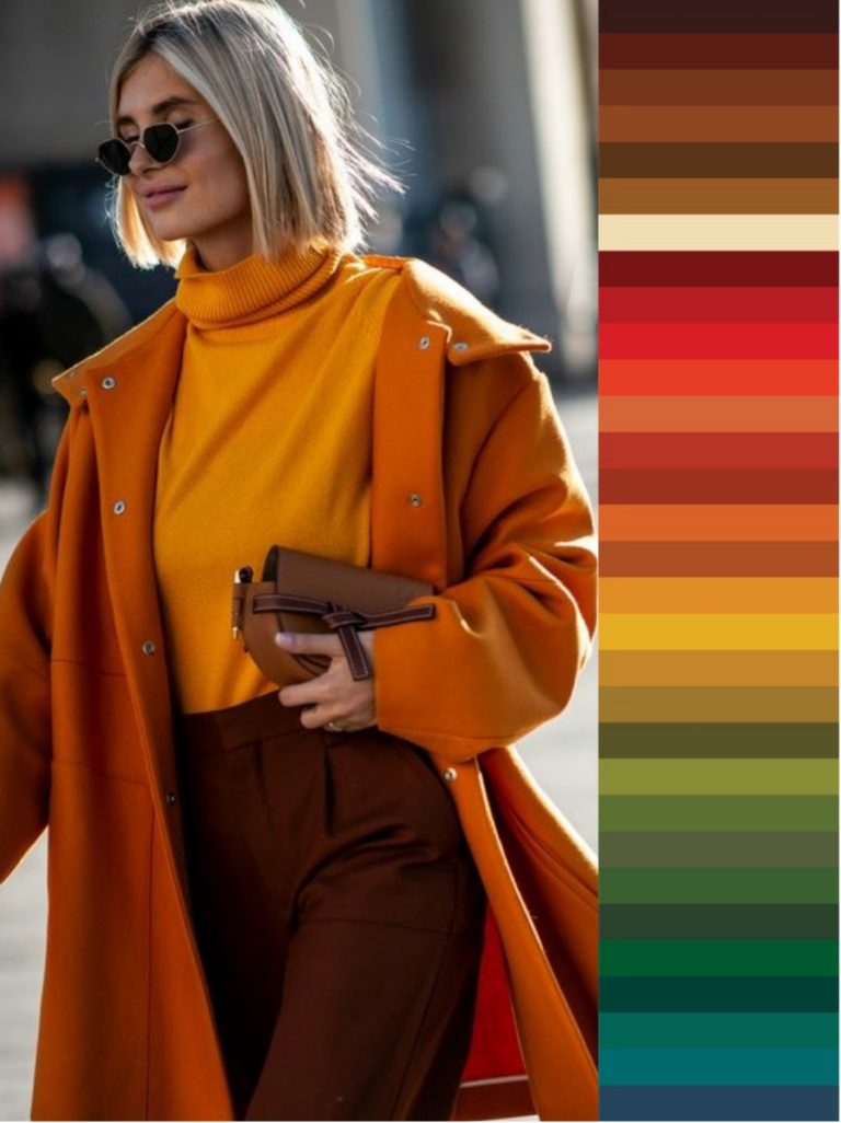
A True Autumn wardrobe works beautifully when the colors feel connected to one another.
Instead of relying on stark contrast, focus on combinations that feel layered and harmonious.
Good styling directions include:
True Autumn does not need black and white to create sophistication.
In fact, black can often feel too harsh.
Deep brown, warm navy, olive, and softened cream usually create a more flattering foundation.
Certain colors can disturb the natural warmth and softness of this palette.
Be careful with:
These colors can feel disconnected from the warmth of the complexion and make the overall look appear harder than it needs to be.
True Autumn makeup works best when it follows the same principles as the clothing palette: warm, rich, and softened.
Beautiful directions include:
The goal is to deepen and support the natural warmth already present in the face.
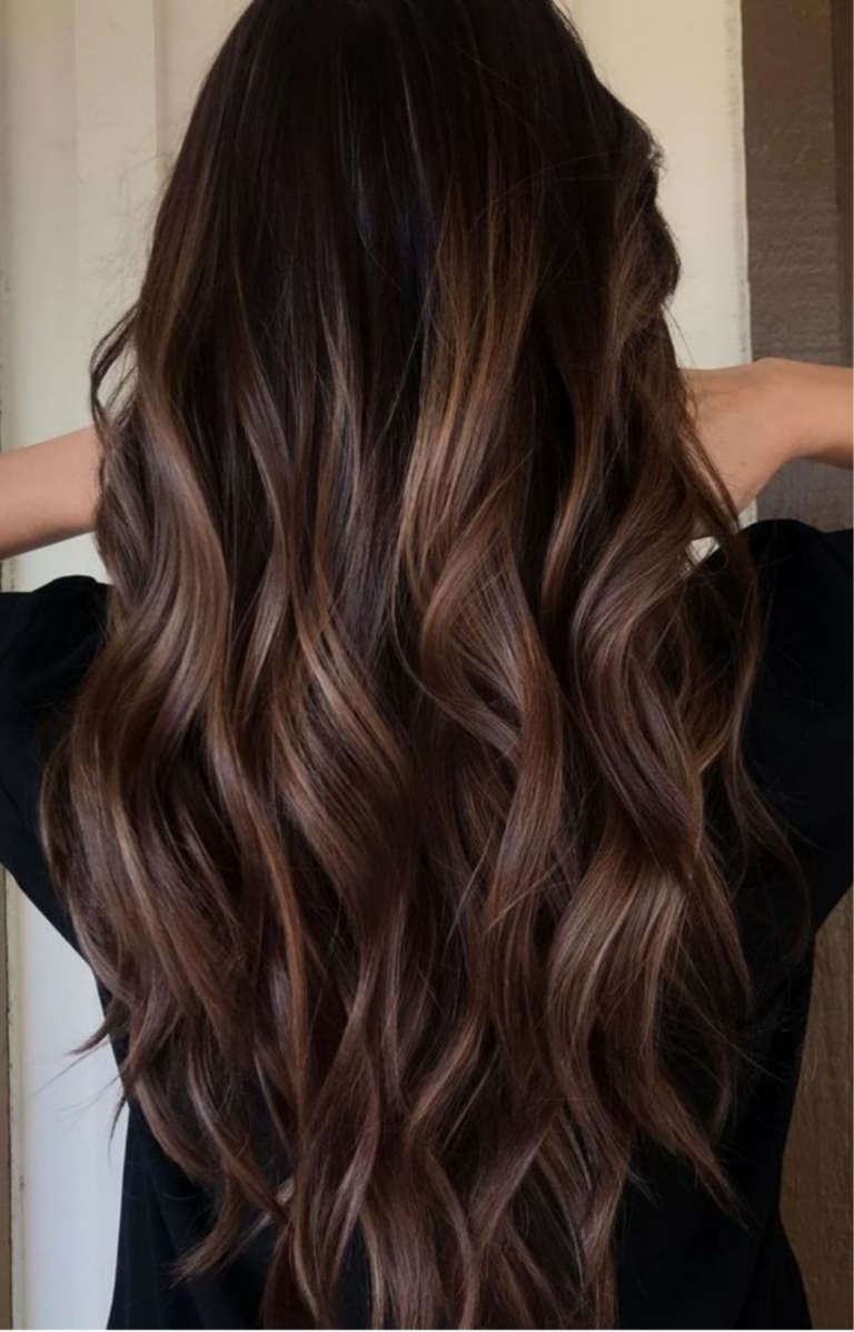
Hair color should also stay warm.
Chestnut, auburn, copper, and warm brown tones usually integrate beautifully, while very ashy or icy hair can disrupt the harmony.
This is an important distinction in the 16-season system.
Warm Autumn flows between True Autumn and True Spring.
Because of the Spring influence, Warm Autumn colors become:
True Autumn remains:
The undertone of both is fully warm, but the level of brightness and depth is different.
This is why two people can both clearly belong to Autumn and still need very different palettes.
True Autumn styling can be incredibly sophisticated, and you are certainly not limited to the predictable combinations we tend to associate with Autumn.
Yes, mustard with peacock blue can be beautiful. But your palette gives you so much more to work with.
One of the greatest advantages of knowing your season is that the colors within your palette share the same color dimensions. This gives you tremendous freedom to combine them in ways that still feel harmonious.
You can create tonal outfits, unexpected color pairings, softer combinations, richer combinations, and everything in between.
And sometimes this is exactly where people get stuck. You know your colors individually, but when you open your closet, you still wonder: what do I actually put together?
This is why I created the Color Styling Guide.
It includes 256 visual color combinations for your season, giving you inspiration for styling tops and bottoms and showing just how versatile your True Autumn palette can be.
Instead of repeating the same familiar combinations, you can start exploring your palette with much more confidence and creativity.
I hear this all the time:
“I can never find my colors in spring.”
“Everything in stores right now is too bright.”
“True Autumn colors only appear during fall.”
Believe me, your colors are there.
True Autumn shades are available in stores throughout the year. What changes seasonally is how retailers style them, which fabrics they use, and which colors receive the most attention.
In summer, your palette may appear in lighter fabrics, dresses, linen, swimwear, and accessories. In winter, those same color dimensions may show up through knitwear, coats, leather, and deeper layering pieces.
Your palette does not change with the calendar.
Traditionally, I would have told you that the solution is to train your eye so you become better at recognizing your shades.
And yes, you absolutely can develop that skill.
But now there is a much easier way.
With → Color Match, you can shop online through the app, select your True Autumn palette, and check whether the color you are looking at belongs within your season.
So when you see five different greens online and start wondering which one is actually yours, you no longer have to rely on guessing.
→ Shop your True Autumn colors with Color Match
And when you are shopping in person, your → Pocket Palette gives you your colors right in your hand so you can compare shades as you shop.
The goal is simple: your palette should make shopping easier, not turn it into another complicated project.
Finding out that you are a True Autumn gives you the foundation.
Then comes the fun part: actually using it.
Learning which colors to buy, discovering new combinations, adjusting your makeup and hair, and gradually building a wardrobe that works together is where color analysis becomes part of your personal style.
You do not need to replace everything immediately. You do not need the perfect wardrobe by next month.
Start using your palette every time you make a new choice.
One top.
One lipstick.
One beautiful new color combination at a time.
Over time, something wonderful happens. Your wardrobe becomes increasingly cohesive because every new piece speaks the same color language.
And you have tools to support each step:
→ Pocket Palette for recognizing your shades while shopping in person
→ Color Match for checking colors while shopping online
→ Color Styling Guide for discovering 256 ways to combine the colors you already have
Your True Autumn palette should never feel like a list of restrictions.
It should give you more possibilities, better purchases, and a wardrobe that becomes easier and more enjoyable to style.
And if you still do not know your season, begin with a professional 16-season color analysis. Once you know exactly which palette belongs to you, everything else has a much clearer direction.