If you’ve ever felt drawn to the warmth of the autumn color palettes and the cool tranquility of Summer — yet never fully aligned with either — you may belong to Muted Autumn, often confused with Soft Autumn, one of the most nuanced and quietly refined seasons in the 16-Season Color Analysis System.
This season is frequently misunderstood because many online resources still rely on the 12-season Soft Autumn color analysis, which is not equivalent to Muted Autumn in the 16-season framework.
Let’s bring clarity, elegance, and a little Julia-style finesse to this beautifully neutral season.
In the 12-season system, Soft Autumn is described as warm, muted, and lighter compared to the True Autumn color palette.
But in the 16-season framework, Muted Autumn (Soft Autumn) is entirely neutral in undertone, which has a major impact on the soft autumn skin tone and overall appearance.
It sits between True Summer and True Autumn, sharing their softness while staying temperature-balanced:
Muted Autumn is the point where warmth and coolness dissolve into calm, harmonious neutrality — something the traditional warm autumn color palette does not offer.
Muted Autumn is one of the most delicate and refined palettes in the entire system. Its harmony comes from balance, not boldness — which makes it extremely difficult to identify through DIY soft autumn color analysis.
This season doesn’t show clear warm or cool signals. Instead, its features tend to feel:
Many Muted Autumns borrow hints from both Summer and Autumn, often wondering “Am I soft summer or soft autumn?” — yet never strongly enough to fully match either.
Because Muted Autumn’s harmony is found in such subtle neutrality, true identification usually emerges only through professional draping, where micro-shifts in undertone, depth, and saturation can be seen directly on the skin.
It’s not a season defined by standout traits — it’s defined by the absence of extremes.
Not sure if this is your season? Book a professional color analysis
(soft summer vs soft autumn explained)
Muted Autumn and Muted Summer share softness, which is why soft summer vs soft autumn is one of the most common confusions in color analysis.
The difference lies in temperature influence:
Both seasons avoid intensity, but they respond to color in completely different ways.
Muted Autumn thrives in neutral, softened autumn colors palette shades, steering clear of anything icy, overly warm, or highly saturated.
Instead of memorizing specific shades from a soft autumn palette, think in direction:
If you’ve ever asked “what is soft autumn color palette?” — the answer is not brightness, but restraint.
This palette embodies quiet sophistication — understated, harmonious, effortless.
Muted Autumn is one of the trickiest palettes to recognize while shopping because the differences between the right and wrong shade can be incredibly subtle.
Two greens, two roses, or two browns can look almost identical at first glance, yet only one may actually belong within your palette.
If you are shopping in person, your Pocket Palette gives you a much broader range of Muted Autumn shades to reference and compare while you shop.
And for online shopping, Color Match makes the process much easier. Simply select your season, shop through the app, and check whether the color you are looking at belongs within your Muted Autumn palette.
→ Explore the Muted Autumn Pocket Palette
→ Shop your Muted Autumn colors with Color Match
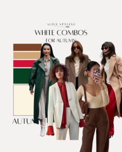
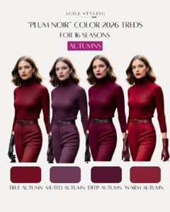
(soft autumn clothes & outfits in practice)
Picture a wardrobe that feels like a watercolor painting — blended, serene, intentional.
Muted Autumn wardrobes often include:
These soft autumn outfits feel modern, refined, and quietly luxurious — never overpowering the wearer.
Knowing which colors belong to your palette is one part of the process. Knowing how to combine them beautifully is where styling really begins.
Muted Autumn gives you far more possibilities than beige, taupe, and a few predictable earthy combinations.
This is exactly why I created the Color Styling Guide.
It includes 256 visual color combinations for your season, giving you inspiration for styling tops and bottoms and helping you see how versatile your Muted Autumn palette can really be.
(best makeup for Soft Autumn)
The most flattering soft autumn makeup follows these principles:
Think muted blushes, soft browns, neutral peaches, and soft autumn lipstick shades that enhance rather than compete.
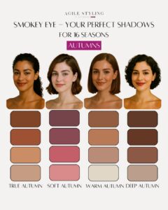
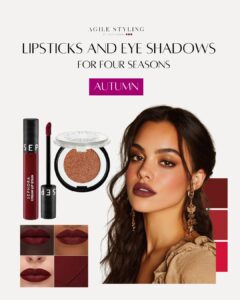
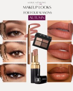
Makeup can be particularly tricky for Muted Autumn because the palette is so neutral. A lipstick that is slightly too warm or a blush that leans too cool can quickly disturb the balance.
If you want a simpler starting point, the Muted Autumn Makeup Guide includes curated makeup recommendations selected specifically for your season.
(soft autumn hair color & hair colors to avoid)
The most flattering soft autumn hair color stays within the neutral-brown spectrum:
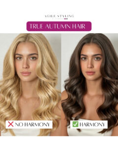
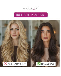
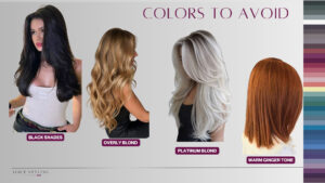
Hair colors to avoid include anything too golden, brassy, icy, or overly ashy — these disrupt the delicate balance of a neutral autumn skin tone color palette.
Hair is one of the largest blocks of color surrounding your face, so keeping it aligned with your season can make a significant difference to the overall harmony.
If you are considering a color change or simply want a clearer understanding of what works, the Muted Autumn Hair Guide gives you season-specific examples and visual direction for choosing your best hair colors.
→ Explore the Muted Autumn Hair Guide
(soft autumn jewelry)
Muted Autumn looks best in softly finished metals:
Highly polished yellow gold or stark silver can overpower the harmony. Choosing the right jewelry metals that suit Soft Autumn maintains balance.
Both illustrate how understated tones elevate neutral, muted features.
A common misunderstanding is that Soft Autumn (12 seasons) is simply a lighter Autumn.
In reality, the warm soft autumn color palette is warm — while Muted Autumn in the 16-season system is neutral.
This distinction dramatically changes how soft autumn colors, makeup, hair, and clothing interact with the skin.
One client spent years oscillating between True Autumn and True Summer, constantly questioning soft summer or soft autumn?
Some autumn colors palette shades made her glow; others turned her yellow.
Some Summer tones felt gentle; others washed her out.
In the 12-season system, she was labeled Soft Autumn — but warm softness overwhelmed her.
During her 16-season draping, everything clicked.
She wasn’t Soft Autumn. She was Muted Autumn, a neutral season sitting between Summer and Autumn.
Warm tones made her sallow.
Cool tones drained her.
Neutral, softened shades brought instant harmony.
“I didn’t know neutrality existed — but it explains everything.”
And once you know your season, another challenge begins: recognizing those nuanced colors when you actually shop.
Muted Autumn is a perfect example of why this can be difficult. Several shades may appear almost identical to the eye while sitting in completely different palettes.
For years, I told clients to train their eye for color. And yes, that skill develops with time. But color is complicated, and most people simply do not have years of professional color training.
That is exactly why I created Color Match.
When shopping online, you can select your season, browse through the app, and check whether the color you are looking at belongs within your Muted Autumn palette.
It takes one of the most frustrating parts of applying color analysis and makes it much simpler.
Muted Autumn includes deeper, elegant tones that photograph beautifully and work effortlessly for eveningwear — refined, soft, and never overwhelming.
Understanding your exact season transforms:
Color analysis isn’t about limits —
it’s about clarity, ease, harmony, and confidence.
Knowing your season gives you the foundation. Learning how to actually use your palette is where the transformation continues.
That is why I created tools to support every stage:
You do not have to master everything at once.
Start with the area that feels most confusing, use the right tool, and build your confidence one decision at a time.
Muted Autumn should avoid colors that sit at either temperature extreme. Very warm oranges, golden browns, and yellow-heavy shades can pull the complexion too warm, while icy pastels and strongly cool colors can feel equally disconnected. Highly saturated shades and stark black or white may also overpower the natural softness of the palette.
The most harmonious colors stay neutral, softened, and balanced.
The most flattering Muted Autumn hair colors remain neutral and softly blended.
Think neutral brown, mushroom brown, muted chestnut, soft walnut, and other balanced brunette tones.
Avoid anything excessively golden, brassy, icy, or strongly ashy. Muted Autumn relies on neutrality, so pushing the hair too far toward warmth or coolness can disturb the overall harmony.
Build your capsule around neutral, softened, medium-depth colors that naturally coordinate with one another.
Choose versatile neutrals first, then introduce subdued colors from your palette through tops, knitwear, accessories, and layering pieces.
Because the colors within your palette share similar dimensions of temperature, depth, and intensity, they are naturally easier to mix and match.
For more inspiration, the Color Styling Guide includes 256 visual combinations created specifically for your season.
→ Explore the Muted Autumn Color Styling Guide
Muted Autumn and Deep Autumn are both neutral seasons in the Agile Styling 16-season system, but they differ significantly in depth and intensity.
Muted Autumn is softer and generally lighter, while Deep Autumn can carry considerably more depth and stronger color.
A Muted Autumn may be able to wear an occasional deeper shade within her own palette, but borrowing directly from Deep Autumn can quickly become too dark or intense.
The safest approach is to stay within your own palette and use deeper Muted Autumn shades when you want more drama or contrast.
Muted Autumn is one of the most nuanced seasons in the 16-season color analysis system.
Its neutrality makes it particularly difficult to identify through appearance alone. Looking at your hair, eyes, or skin can provide clues, but professional draping is what shows how color actually behaves against your complexion.
If you have never had your colors professionally analyzed, start there.
Once you know exactly which palette belongs to you, shopping, makeup, hair, and styling all have a much clearer direction.